Comparing UIKit and SwiftUI
Marhaba 👋🏼
Ever since Apple unveiled SwiftUI in 2019, there’s been a lot of hype around it and a push to adapt it as the go-to framework to build UIs. SwiftUI has made tremendous progress since being revealed then, and it appears to be a no-brainer for creating new UI flows. Whether or not SwiftUI is ready to be adopted in projects is an engineering decision with many factors to consider.
To really understand why SwiftUI is an incredible framework, I’ll be walking through creating a UI using UIKit and then re-create that same UI using SwiftUI. Excited? Same here.
Yalla, let’s begin.
Note: I’m assuming that you possess some knowledge of Swift and Xcode, so I won’t dive into fundamentals.
Table of Contents
Stack Views - UI Requirements
Before diving into the code, let’s review the UI requirements I defined below:
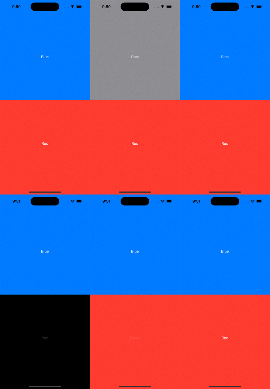
Create two vertical stack views (top and bottom), each occupying half of the screen
Each stack view has a button with the button’s text representing the stack view’s current background color
When user taps button, background color and button text changes. Tapping the button again reverts to original background color and button text.
The button text color should always be white.
Top stack view
Default background color and text is blue
Tapping on button changes background color and text to gray
Tapping button again reverts background color and text back to blue
Bottom stack view
Default background color and text is red
Tapping on button changes background color and text to black
Tapping button again reverts background color and text back to red
To further clarify the above requirements, here’s a screen video below showing the expected UI behavior.
Now that our UI requirements are flushed out, it’s clear we’ll need the following UI components:
Main stack view: A vertical outer stack view that will house two child vertical stack views.
2 child vertical stack views (top and bottom).
A single button for the top and bottom stack views.
We’re now at a good place to start coding this in UIKit.
UIKit
Before diving into the UI, I’ll first create an enum called ButtonType. This enum will be used by both our UIKit and SwiftUI views as we’ll see later.
Time to start creating our view. In the world of UIKit, we’ll need a ViewController to start off. I’ll create a custom VC called StacksViewController.
Next, I’ll initialize all required UI components using lazy variables.
Moving on, I’ll create two bool-type variables to represent button toggling in the top and bottom stack.
Next, I’ll create two private functions - getText and getColor. Each function will return the correct text or color based on the button type and its button mode. This will play a huge role in the UI’s logic.
We’re almost done with logic! I’ll create two more functions - one to trigger a touch event for the top button and another for the bottom button. In each function, I’ll simply toggle the button mode to trigger a bool change.
The last step of our logic - I’ll update our toggle bool variables to include didSet. Any variable change will update the button text and its stack view background color.
Alrighty, time to finalize our UI. I’ll create a function to put our UI together. Each step is marked with comments for clarification.
I’ll create another function to set up auto-layout for our views.
Finally, I’ll use the viewDidLoad method to call setupView followed by setupLayout.
We’ve successfully created our UI using UIKit. A little over 120 lines of code were needed to build our UI.
It’s time to transition to SwiftUI.
SwiftUI
As we go through building our logic and view using SwiftUI, you’ll notice some similarities and differences compared to UIKit.
I’ll start with creating our SwiftUI view.
Next, I’ll create two bool-type variables as we did in UIKit. For now, don’t worry about what @State does.
As we did prior, I’ll create getText and getColor functions.
Sweet. Time to start setting up our UI. I’ll create our main stack view and set its foreground color as white - this will set the text color within all subviews to white.
Within our main stack view, I’ll create our top and bottom child stack views.
In both the top and bottom stack views, I’ll create a button. From there, I’ll set up each button’s tap action and text.
Sweet, I’ll do a couple more things for each child stack view:
Update the
frameof each child stack: this will force them to evenly occupy half the screenUpdate the background color using
getColor
We’ve officially wrapped up building our UI using SwiftUI. How many lines of code did it take to build our view using SwiftUI? Approximately 60 lines of code!
Closing
We were able to successfully create our colorful stack views from scratch using UIKit and then again using SwiftUI. By just analyzing lines of code, we were able to build our view using SwiftUI using half the amount of code compared to UIKit! It’s no wonder why many iOS developers like me fell in love with SwiftUI the moment Apple presented it.
With Apple’s 2023 WWDC taking place this week, make sure to tune in. I’m especially excited about Apple’s updates to SwiftUI.
Besides lines of code, what are additional differences you saw between SwiftUI and UIKit? Feel free to add your thoughts in the comments section below.
For any comments and questions on this post, follow up on Twitter or leave a comment here.
Make sure to share this article. Appreciate you reading through my blog and until next time.


